
The Menus Widget is part of the Ansar Elements Elementor Add-on.
It enables displaying navigation menus anywhere in Elementor-built templates, such as headers, footers, or custom sections.
This widget provides flexible options for menu layout, appearance, and behavior, allowing fully custom navigation design without coding.
How to Use
- Open any page, header, footer, or custom template using the Elementor editor.
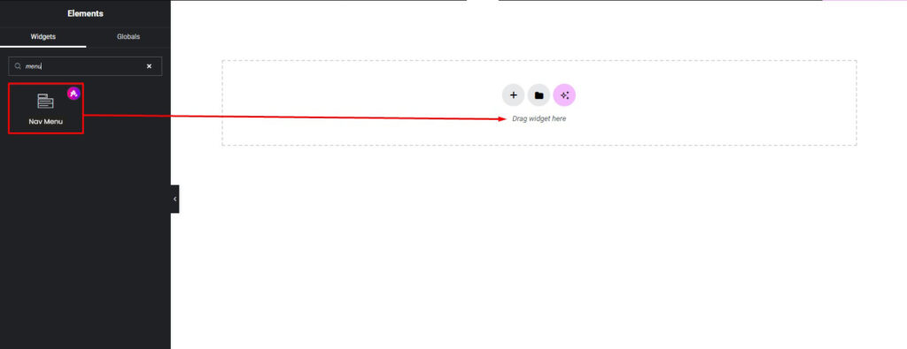
- Locate the Menus Widget in the Ansar Elements section of the Elementor widget panel.
- Drag and drop the widget into the desired area of the layout.
- Select the menu, layout type, and configure content and style settings as required.
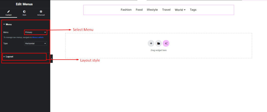
Content Setting
The Menus Widget offers comprehensive configuration options:
- Menu Select Option: Choose from any registered WordPress menu available in the system.
- Menu Type:
- Horizontal: Displays the menu items in a row, typically used for header navigation.
- Vertical: Displays the menu items in a column, useful for sidebar or footer navigation.
- Menu Alignment: Set the alignment of the menu as Left, Center, or Right within the container.
- Submenu Indicator Icon: Select or customize the icon shown for submenu items to indicate a dropdown.
- Gap: Control the horizontal or vertical spacing between menu items for better visual structure..
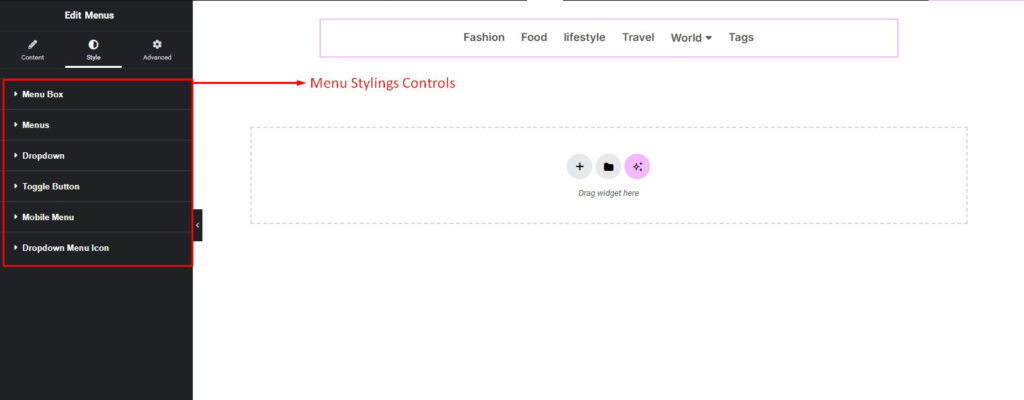
Styling Setting
The Menus Widget includes advanced styling controls for complete customization:
- Menu Box Style:
- Background color, border, border-radius, box shadow, and padding.
- Menu Item Style:
- Text color, typography (font family, size, weight, spacing).
- Hover text color and background.
- Spacing between items (gap control).
- Dropdown Menu Style:
- Background color, border, box shadow, border-radius, padding.
- Dropdown animation settings (slide, fade).
- Toggle Button Style (for mobile menu):
- Background and icon color, size, border, and hover color.
- Toggle button placement and margin.
- Mobile Menu Style:
- Full-screen or dropdown behavior.
- Background color, padding, and spacing for menu items.
- Typography and color settings for mobile-specific design.
- Dropdown Menu Icon Style:
- Size, color, and alignment of the submenu indicator icon. consistency across devices. on all devices.
Pro Tip
- On mobile, enabling the toggle button with a full-screen menu provides a user-friendly experience.