
The Light & Dark Toggle Widget in Ansar Elements allows visitors to switch between Light Mode and Dark Mode on your website. It helps improve user experience by allowing users to choose their preferred viewing mode while maintaining a modern website appearance.
How to Use
- Open a page, header, footer, or template using Elementor Editor
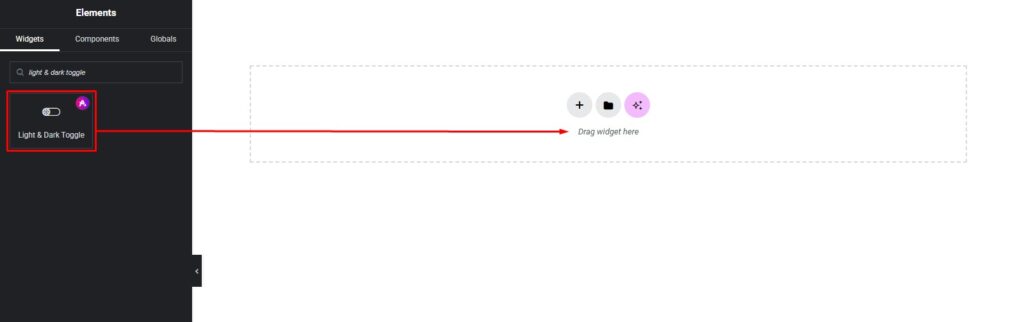
- Locate the Light & Dark Toggle Widget in the Ansar Elements widget section
- Drag and drop the widget into the desired area
- Configure content settings and style options
- Save and publish your changes
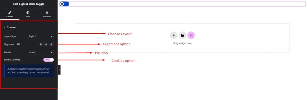
Content Settings
The Light & Dark Toggle Widget includes the following options:
- Layout Style – Select the desired toggle design style
- Alignment – Set Left, Center, or Right alignment
- Position – Choose between Fixed or Inherit
- Save in Cookies – Enable this option to remember the visitor’s selected mode for future visits
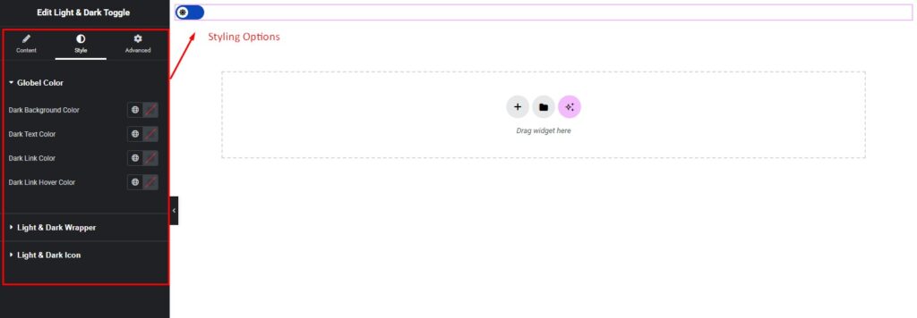
Styling Settings
The widget provides complete styling controls:
Global Color
Customize dark mode colors:
- Dark Background Color
- Dark Text Color
- Dark Link Color
- Dark Link Hover Color
Light & Dark Wrapper
Customize the toggle container:
- Background Color
- Border
- Width
- Height
- Border Radius
- Box Shadow
Light & Dark Icon
Customize icon appearance:
- Icon Size
- Icon Color
- Spacing
- Background Color
- Border-radius
💡 Pro Tip
Enable Save in Cookies so the selected mode is remembered automatically when visitors return to your website. This creates a smoother user experience.